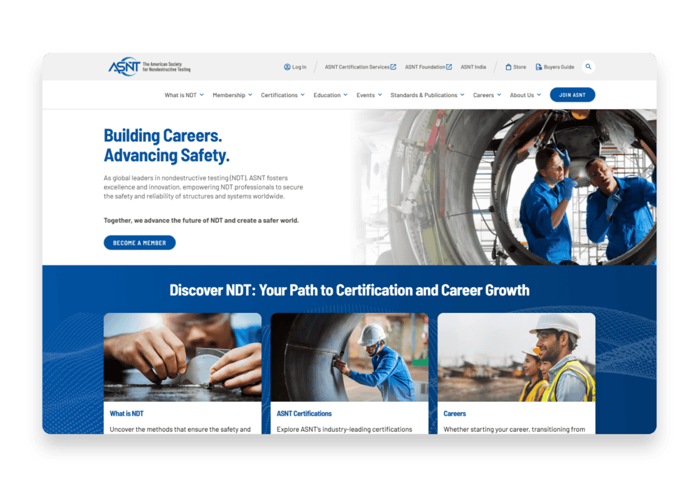
American Society for Nondestructive Testing Transforming the Online Experience Across Three Dynamic Websites Branding // Content Strategy // Design // Development // Storyblok
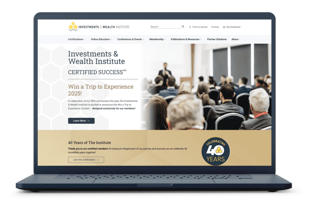
Investments & Wealth Institute Enriching Member Experience, Elevating Association Value Branding // Content Strategy // Design // Development // Storyblok
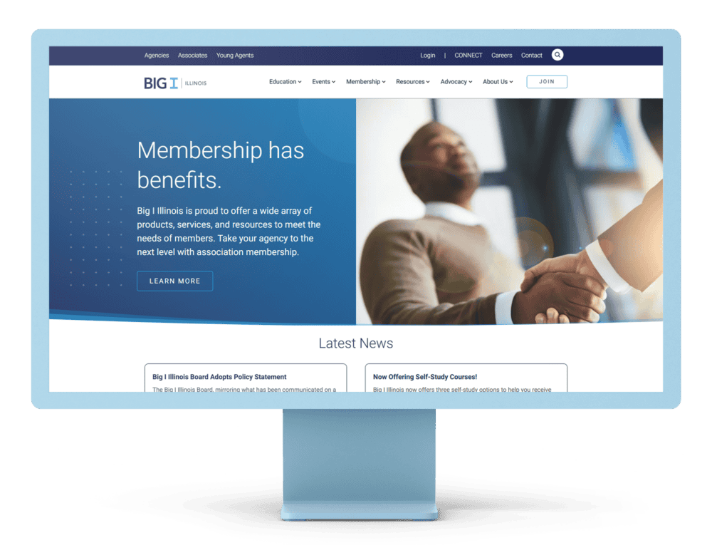
Big I Illinois Ensuring Association Adaptability with a Modern Website CMS Content Strategy // Design // Development // Storyblok


