When creating custom website designs, it’s essential to make sure that the aesthetic and functional design choices made are as inclusive of all website users as possible. Doing so will make the website better for everyone.
Users of websites and online tools are often very different in age, education, cultural background, and more. They have different levels of experience with computers and mobile devices and often have different physical characteristics that affect how they interact with technology (color blindness, physical handicap, etc.). But at the end of the day, they just want to complete their intended action on the website and be on their way. This core similarity is what designing for accessibility is all about. Making websites easier for all users to access the information they’re looking for.
Designs are always created within a set of constraints; client needs, budget, timeline, scope, etc. Accessibility issues are just an additional set of constraints that need to be considered while creating a design. Many designers working with accessibility constraints for the first time may think that these constraints will make their designs less interesting, cluttered, or dull. This is not the case. Accessibility constraints instead lead to more creative and effective solutions that are a better experience for all of your users.
There are a variety of accessibility issues that may affect users of your website. Some key accessibility issues to consider while making design decisions include:
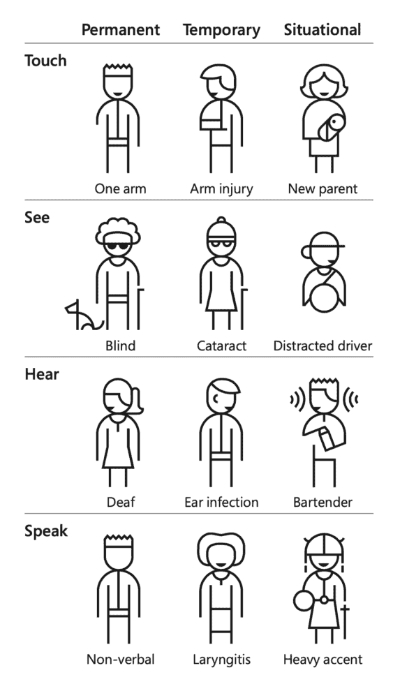
In addition, accessibility issues may not always be permanent. Users may have permanent, temporary, or situational accessibility issues. Microsoft has a handy inclusive design toolkit that highlights how inclusive design can benefit users. Included within is a helpful table about different types of temporary and permanent accessibility issues (shown below).

Remember, making your website or app more accessible makes it more useful for everyone. Making things easier for your users builds trust in your brand, leads to greater customer satisfaction, and higher conversions.
We can help you make your next web project more accessible and inclusive, leading to increased growth and profitability. Contact us today.

Stay up to date on what BizStream is doing and keep in the loop on the latest in marketing & technology.