“Anything is possible with code.” This is a very common phrase thrown around when talking to clients or development teams about implementing features on a project. As I have transitioned from development into the design world, that phrase has quickly become “Anything is possible with code, but only with a good design.” As a web designer, it is important to bridge the gap between development and design through your work. Doing so allows for successful implementation, the ability to achieve realistic timelines, and ultimately, the delivery of a full-fledged, pixel-perfect web complaint site to your client. In order to achieve these project milestones, you must design with your developer in mind. Throughout my design process, I quickly found out that there are plenty of do’s and don’ts when it comes to creating something that can turn into clean and working code.
I will be going over five basic design rules to follow to ensure that your work is always created with the developer in mind.
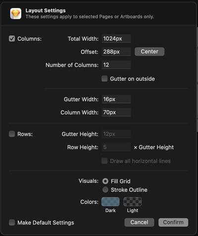
1. Use The Grid. Consistent layouts are key to making sure your designs are perfectly implemented in code. The first steps in designing always start with determining your canvas, layout, and grid settings. Using the grid is crucial to allow for fluid and responsive design and is a big determining factor in how consistent your design project will be. What exactly is the grid? Is a twelve-column layout that has become standard in design due to its flexibility in dividing columns for responsive design. Most design tools have a grid layout system already baked in and are very easy to set up. When I use Sketch, I can set my grid for a workspace fairly easily.
An example of a common grid setup is shown here:

Once you define your grid for a project, be sure to note these specifications in a style guide that is provided to the development team. That way, they can easily translate any gutters, widths, or layouts in their code with any front-end framework that is built off of this same concept.
I will be going over five basic design rules to follow to ensure that your work is always created with the developer in mind.
Consistent layouts are key to making sure your designs are perfectly implemented in code. The first steps in designing always start with determining your canvas, layout, and grid settings. Using the grid is crucial to allow for fluid and responsive design and is a big determining factor in how consistent your design project will be. What exactly is the grid? Is a twelve-column layout that has become standard in design due to its flexibility in dividing columns for responsive design. Most design tools have a grid layout system already baked in and are very easy to set up. When I use Sketch, I can set my grid for a workspace fairly easily.
An example of a common grid setup is shown here:

Once you define your grid for a project, be sure to note these specifications in a style guide that is provided to the development team. That way, they can easily translate any gutters, widths, or layouts in their code with any front-end framework that is built off of this same concept.
Accessibility awareness is on the rise, and if you are in any way involved in tech, there is no doubt that you have been part of a discussion involving web accessibility and ADA compliance recently. From seminars to certifications, it is becoming super important to make sure that designers and developers aren’t only gaining knowledge of, but also creating their work based on the Web Content Accessibility Guidelines (WCAG). So why is this so important? As an engineer, you need to make sure that your product is accessible and has a consistent user experience for all of its users. The WAI (Web Accessibility Initiative) states, “Making the web accessible benefits individuals, businesses, and society. International web standards define what is needed for accessibility.” TLDR; you want to make sure that the product you are creating doesn’t get you sued.
These guidelines are a set of rules constructed to guide you to keep your site compliant, but this all starts with the design. A common issue I find when I am looking at certain designs or websites is regarding their color palette being used. One accessibility rule states your site must ‘ensure that a contrast ratio of at least 4.5:1 exists between text (and images of text) and background behind the text’. This seems simple enough but is often a common issue missed by many by the time it gets into the hands of the developer. Luckily, there are countless tools, both native and for download, to help guide you to make sure your site is compliant. One tool I commonly use to create my color palette for any project is WebAIM’s color contrast checker. This is a simple tool to help make sure that you are creating web-compliant color pallets for your design style guides that are code-ready.
Another great tool is the Cluse plugin for Sketch. This free-of-charge tool helps you test the contrast of various color layers within your project.
As a designer, it is hard to fight the urge to create the most extravagant deliverable with all the bells and whistles for the client. You want to deliver the next best thing; we all do. However, the design process is very similar to code. By following concepts of ‘not reinventing the wheel’ or the KISS principle (Keep It Simple, Stupid), as a designer, you will natively start thinking in terms of code early on in the process. Know your audience you are designing for, and don’t overcomplicate things.
Setting a good foundation for a website through your design is crucial to allow for additional development to be implemented in the future. Your MVP design should consist of pages constructed by reusable components globally used throughout the project. Constantly ask yourself, ‘Where can this design element or feature be reused?’ Noting these consistencies in the documentation and style guide for the development team will be huge for consistency and estimating the project.
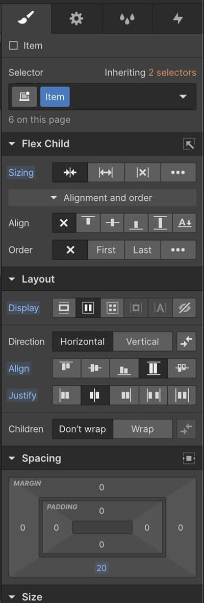
Coming from a development background, it is almost second nature for me to think, ‘How can this be implemented in code?’ when creating something. This isn’t always the case for some designers. Luckily, there are tools out there to help you grasp development concepts and implement them into your designs. Webflow is a tool for designers to create fully functioning websites without touching any code. It is also a great way to design with front-end concepts in mind.
The dashboard is very CSS-focused and allows you to create your designs in a very code-oriented way.

Webflow’s design dashboard even gives you the ability to apply already existing styles through its ‘selector’ system which directly translates to CSS classes in HTML. Webflow is a great tool for any designer who is new to writing CSS and wants some knowledge of various CSS properties. W3Schools also has a great CSS Course if you want to learn some of Cascading Stylesheets’ basics.
By now, you should be well acquainted with concepts of the grid, style guides, reusability in your designs, and so on. How can you make sure that all of these concepts are being implemented correctly in your design project? Trial and error, for one, but another important concept when it comes to working with a development team is collaboration. Whether it is through your deliverables or down to features to be implemented, any input from an outside-of-the-design team member will always be beneficial for your work.
At my previous employer, I was a front-end developer working with the design team, on the same floor, same row, sometimes even the same desk as me. There was a constant flow of communication when it came to their designs. ‘How long would this variation take to develop over this one?’ ‘Is this even doable?’ ‘How would you approach this in your code?’ were common questions early on in any project’s design process coming from the designer. We were not siloed, and we were more often working together than not. This is why I feel like having an in-house design team is crucial to any development shop’s success. Not just because it helps with keeping things internalized from a billing and estimating perspective, but because at the end of the day, teams are meant to work together in the same space to reach the same goal: create an awesome product for the client.
Tech is forever changing. Design is also forever changing. With new tools popping up every day to countless design systems to work with, it can be a bit overwhelming. Knowing how to work with your development team is key. Keeping collaboration, consistency, and web-accessible deliverables in mind, you will be successful in creating web-focused designs. If you are new to design like me, a graphic designer turned web, or even a complete career change into the design world, know that you will be on track to start designing like a developer in no time with these five steps.
We love to make cool things with cool people. Have a project you’d like to collaborate on? Let’s chat!
Stay up to date on what BizStream is doing and keep in the loop on the latest in marketing & technology.